Mezza Restaurant Website Design
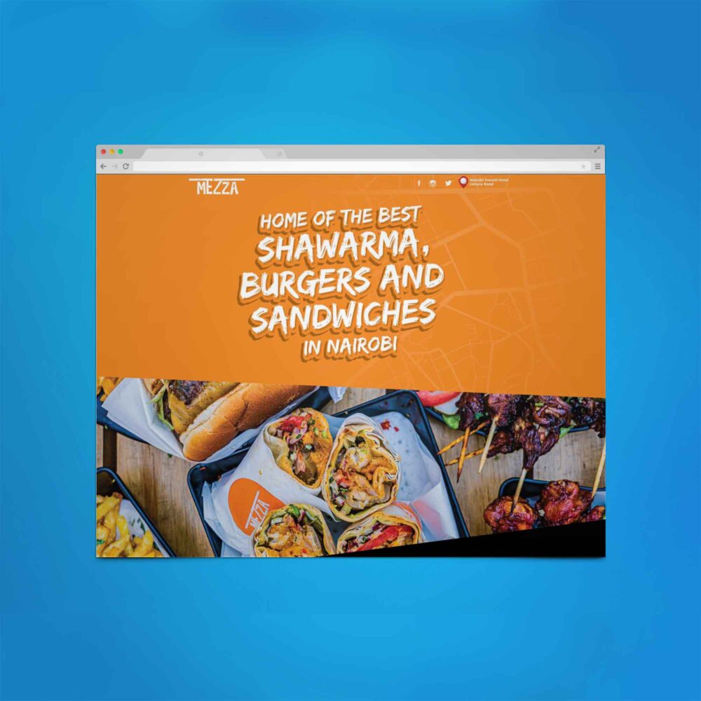
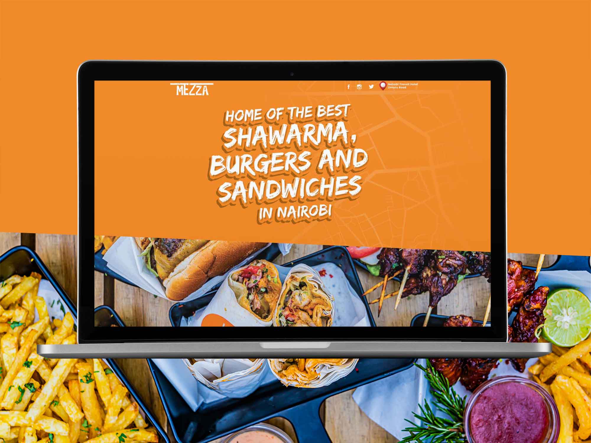
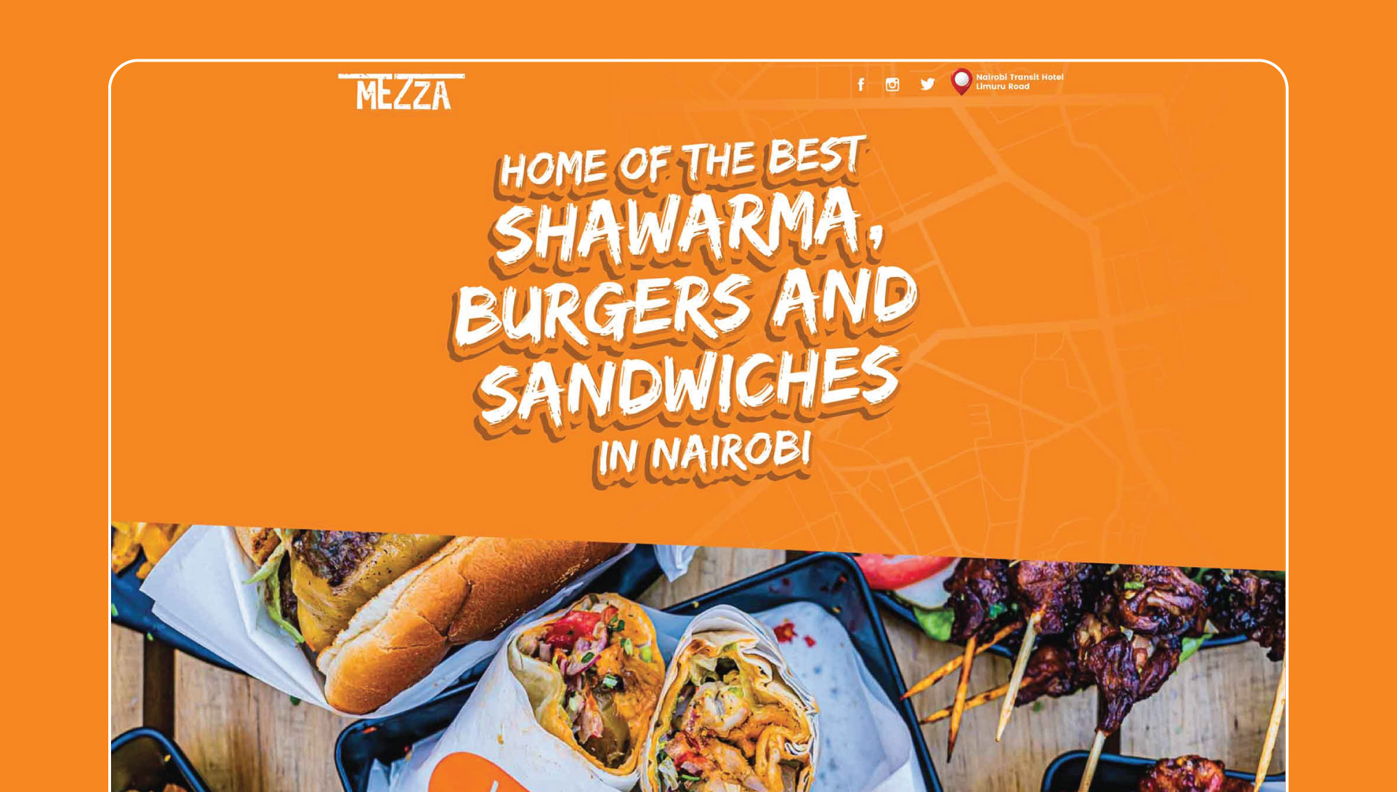
Mezza Restaurant wanted a website design that spoke very quickly to the target to demographic (students with limited attention spans and budgets) about exactly what it was that they sold (fast food served in large quantities), and what quality they were hoping to deliver.
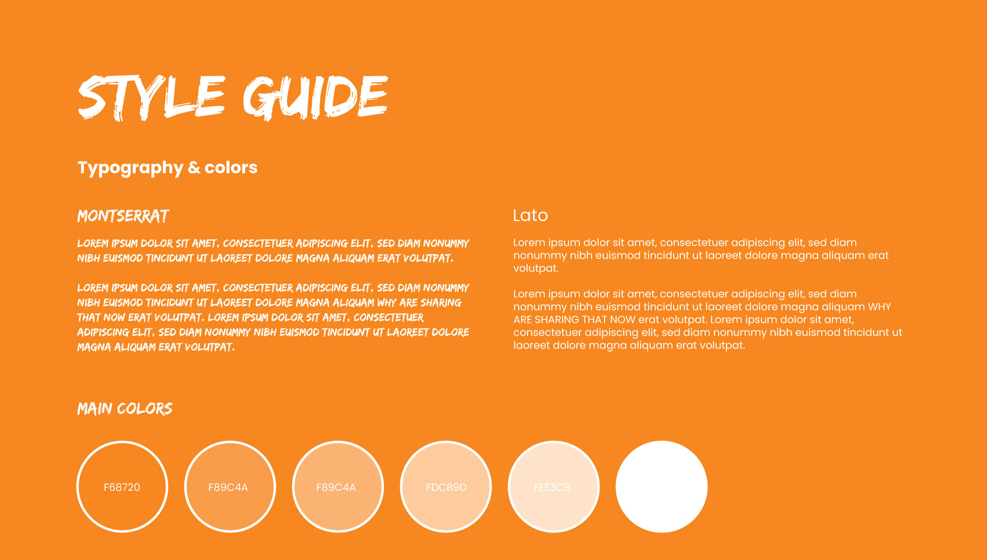
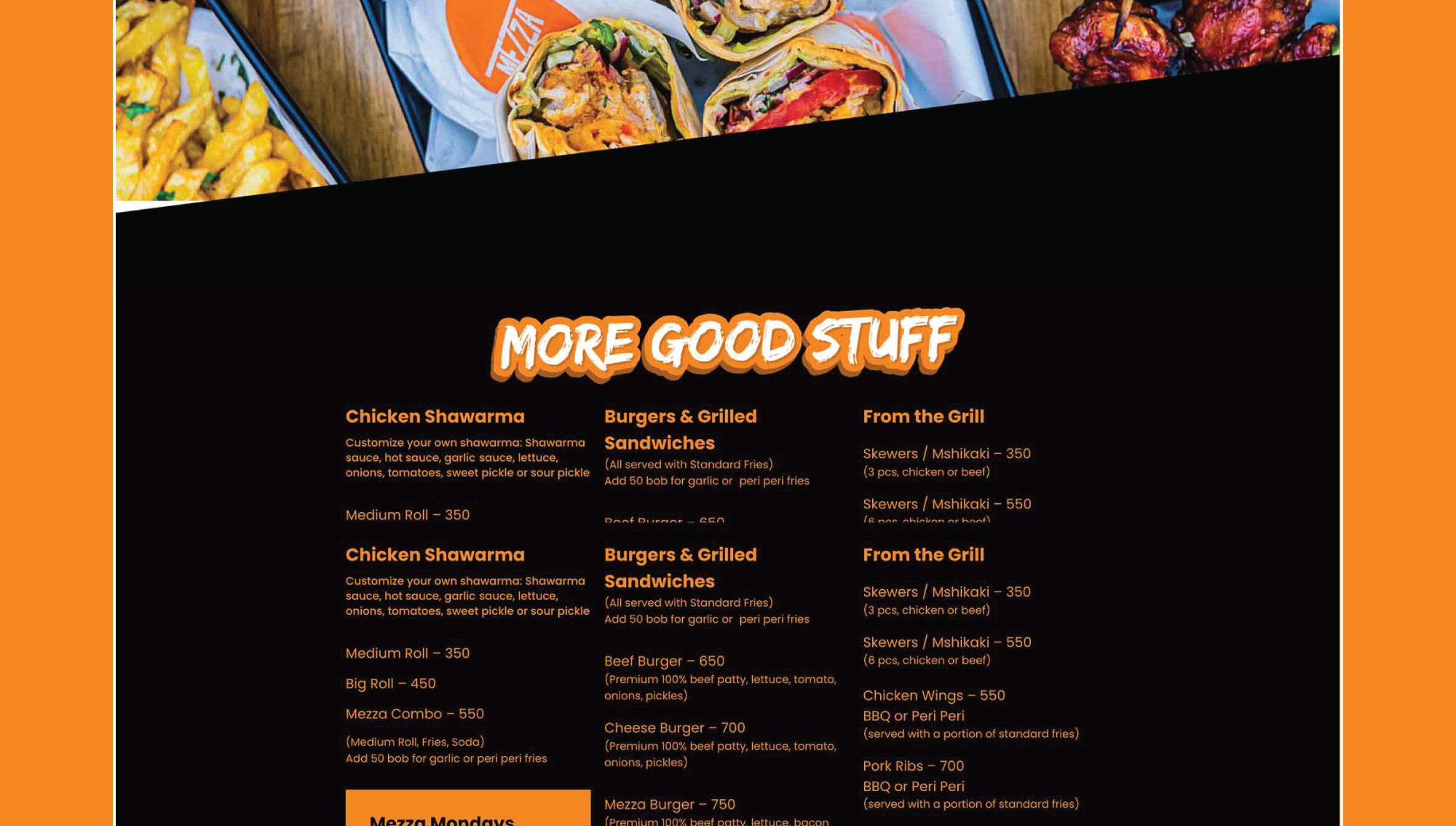
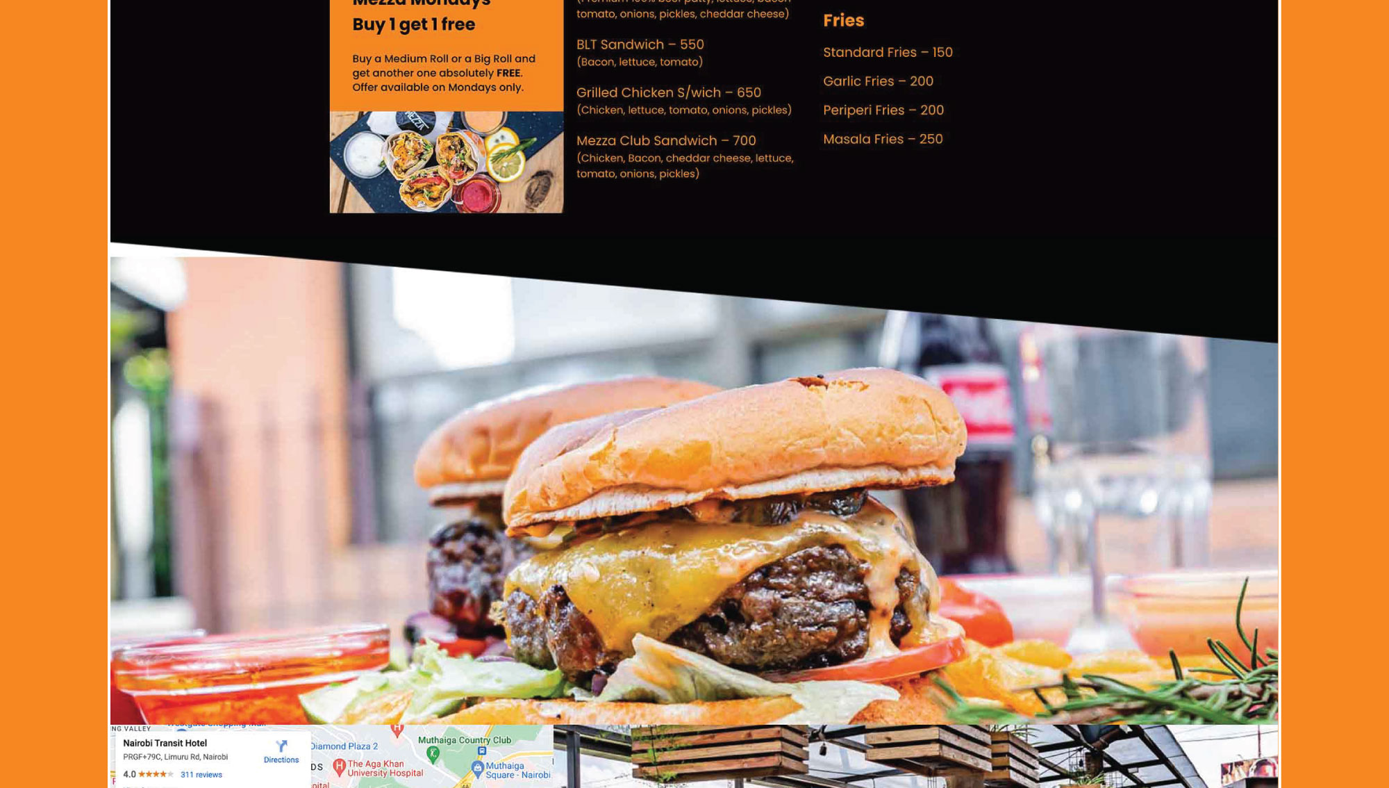
The website has high contrast and quality photography, and a detailed menu that shows the options that students can choose from when they’re making their orders. It also displays Mezza Restaurant’s changing offers, and when these offers can be taken advantage of.
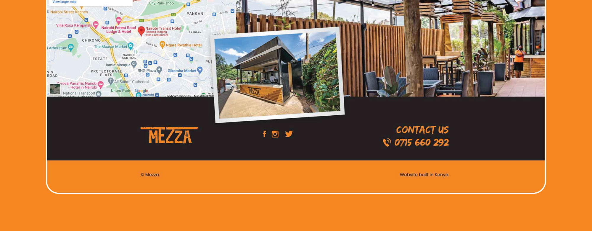
Mezza Restaurant wanted a simple website design. They wanted a website that was only one page long and allowed students to connect with them on social media to see the ambience of the restaurant, as well as some of the food that they would be served in the restaurant. Finally they wanted their clients to also see very quickly where the restaurant is located.
You can see the website we designed at www.mezza.co.ke.
Do you have a website design need do not hesitate to reach out to us through our contact from here.
